avertra logo
Our new logo symbolizing connection, insight, and harmonious, sustainable transformation. Explore full meaning here.
Clear spacing
Logo clear spacing ensures there's ample surrounding space around a logo, maintaining its visibility and impact, crucial for brand recognition and legibility across various mediums.
Awesome with
clear spacing.
This is an example of how the text maintains minimum spacing from the logo.
Chaotic without clear spacing.
This example shows the text and margins overlapping with the minimum spacing of the logo.
avertra logo don'ts
Change the color or add gradients
Distort or squash the logo
Recreate or change the font
Use outlines or add thickness
Add an image inside the logo
Rotate or skew the logo
Use busy backgrounds behind the logo
Change the spacing and proportions
Add shadows or other effects
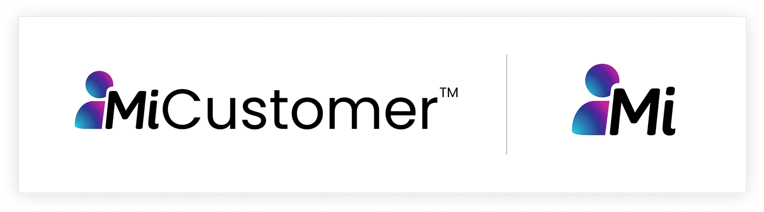
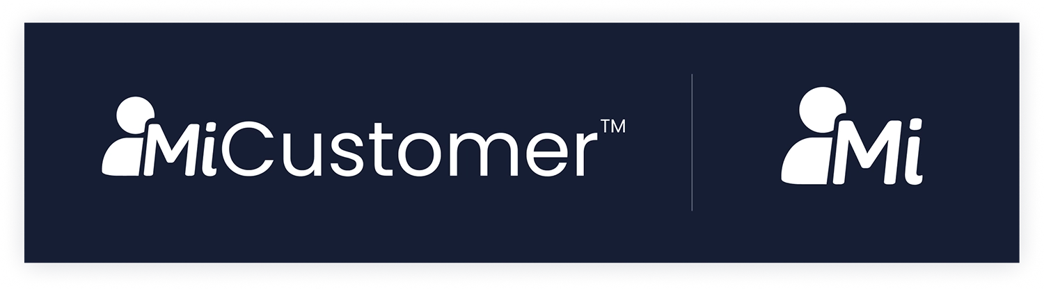
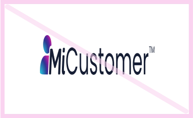
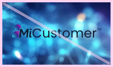
MiCustomer logo
Our MiCustomer logo showcases our key motivator: humans. The logo may be used in the following versions only.
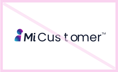
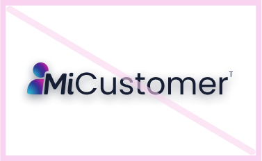
Clear spacing
Logo clear spacing ensures there's ample surrounding space around a logo, maintaining its visibility and impact, crucial for brand recognition and legibility across various mediums.
Awesome with
clear spacing.
This is an example of how the text maintains minimum spacing from the logo.
Chaotic without clear spacing.
This example shows the text and margins overlapping with the minimum spacing of the logo.
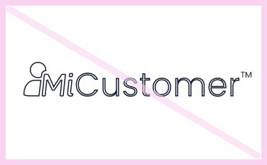
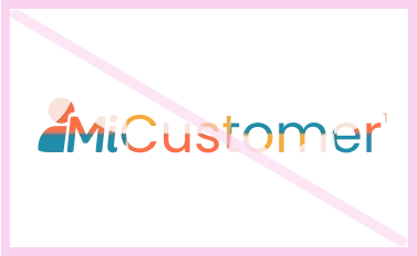
MiCustomer logo don'ts
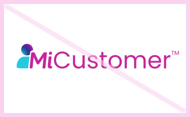
Change the color or add gradients
Distort or squash the logo
Recreate or change the font
Use outlines or add thickness
Add an image inside the logo

Rotate or skew the logo
Use busy backgrounds behind the logo
Change the spacing and proportions
Add shadows or other effects
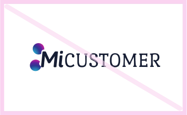
MiCustomer module logos

Logo kit
Don't get stuck in the past.
Download all official avertra & MiCustomer logos here and showcase them in your work! We'll be checking who uses them wrong 🔍👀
Brand colors
Primary colors
Dark is king, white is timeless and the tech world loves blue, so we chose blue with a twist! Copy the color codes below into your softwares for an accurate match.
Reliable Navy


Human Cyan
White
Secondary colors
To support our core colors and add life to our branding, the following secondary colors can be used sparingly to add accents or visual focus to a design.
Authentic Blue
Adaptive Purple
Vibrant Magenta
Human Cyan
Authentic Blue
60%
Adaptive
Purple
30%
Vibrant
Magneta
10%
Brand typography
Poppins
Poppins is a very balanced font. Its readability is retained on both, small and large scales due to its geometric balance and monotone height, making it ideal for both web and print. The many different styles of this typeface make it an all-rounder typeface.
Ae Bb Cc Dd Ee Ff Gg Hh Ii Jj Kk Ll Mm Nn Oo Pp Ww Xx Yy Zz
Ae Bb Cc Dd Ee Ff Gg Hh Ii Jj Kk Ll Mm Nn Oo Pp Ww Xx Yy Zz
!@#$%^&*()_+<.>,”:][
Usage
- Bold for large, title headlines.
- SemiBold for large, sub headlines.
- Regular is for all body texts or long paragraphs.